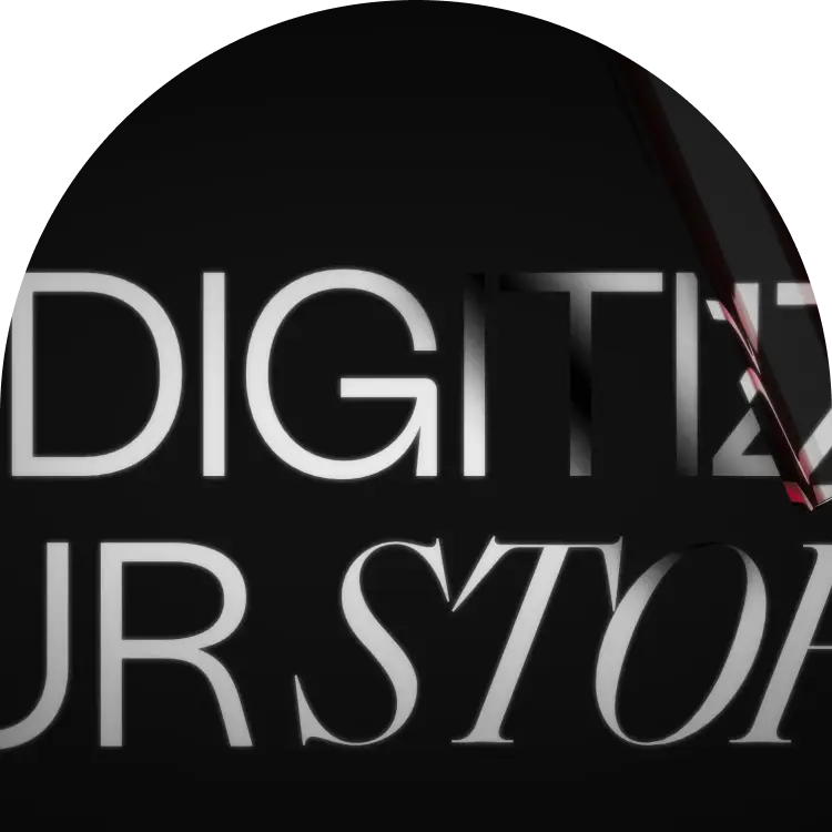
Vre
Building a zero-to-one product.
Vre
A web app designed to break down the barriers to entry and make Vancouver’s real estate market more accessible.
Product designer
Miro, Figma, Illustrator, Photoshop
3 designers, 1 PM, 1 project lead
16 months
0-1 product, web application, mobile
Kaydence
Overview
Vancouver's real estate market is notoriously complex and overwhelming for homebuyers. This project was initiated to solve that problem by creating a platform that provides clarity and empowers users to navigate their journey with confidence. As the lead designer from Kaydence, one of two agencies collaborating on the MVP, my role was to translate this ambitious vision into a tangible product strategy. Working alongside a partner designer and a project team, I helped define the core user needs and business goals that would guide our path to a successful prototype.
Though the project was ultimately put on hold by the founding team post-MVP, it was a formative experience. It taught me invaluable lessons about the realities of 0-to-1 product design, the dynamics of cross-agency collaboration, and the critical importance of balancing a bold vision with a focused, user-centered execution.


The Challenge
Our primary challenge was translating the founders' ambitious but undefined vision into a viable product strategy. This required establishing a ruthless focus on the MVP, cutting through a vast set of potential features to define the core user journey that would deliver immediate value. Simultaneously, we had to engineer a new brand identity from scratch that could manufacture trust and credibility in a crowded market. All of this was compounded by the operational complexity of unifying two separate agencies, each with its own workflow, around a single, cohesive product vision.
100%
41%
24%
" How can we make Vancouver's real estate market more accesible?

The Approach
Strategy & MVP Scoping
I defined the strategic path to MVP by creating a phased product roadmap, which narrowed the initial feature set to focus on core user needs.
Brand Identity & Trust
To build trust with a new audience, I established the foundational brand identity and designed initial promotional materials to support early marketing.
A Scalable Design System
Based on the brand direction, I built a scalable design system from the ground up to ensure a consistent user experience that could grow with the product.
Prototyping & Alignment
Finally, I developed a high-fidelity prototype of the core user experience, which was the key tool for aligning stakeholders and validating the product's value.
Defining the Core Experience
To ensure a successful and timely launch, our primary strategic decision was to ruthlessly prioritize the core user experience for the MVP. We deferred a number of ambitious social and content features to a later phase. This allowed us to focus all our energy on perfecting the essential tools a homebuyer needs to feel empowered, not overwhelmed.
Phase 1: The Core MVP
Features designed to deliver immediate value and a streamlined search experience.
- Choice-Based Search: A guided search that lets users quickly tailor results.
- Interactive Map Search: An intuitive, map-based search that visually organizes neighborhoods and listings into clear value tiers.
Phase 2: Future Expansion
Ambitious features planned for the product roadmap post-launch.
- Reel Highlights
- Video Channels
- Social Profiles

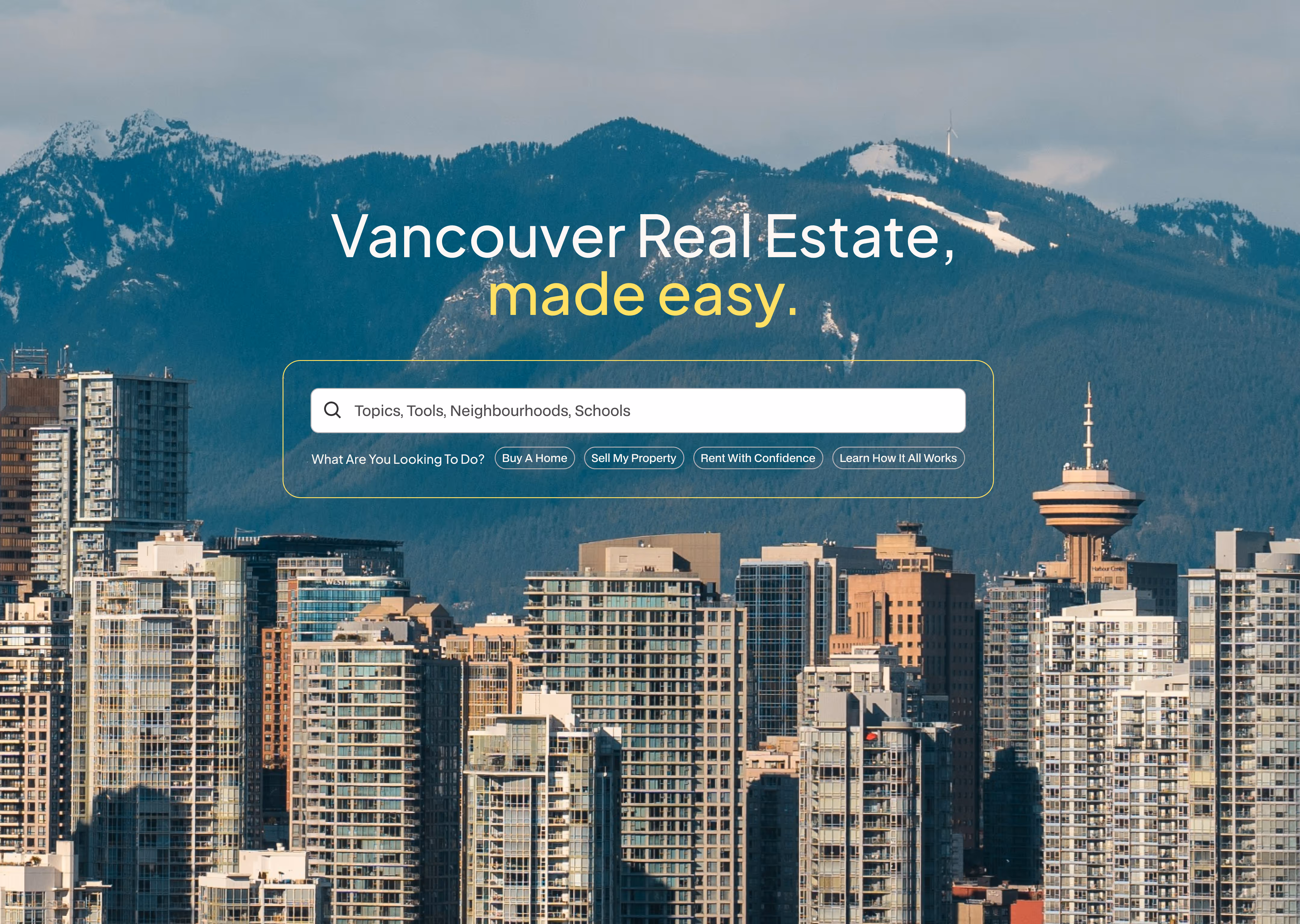
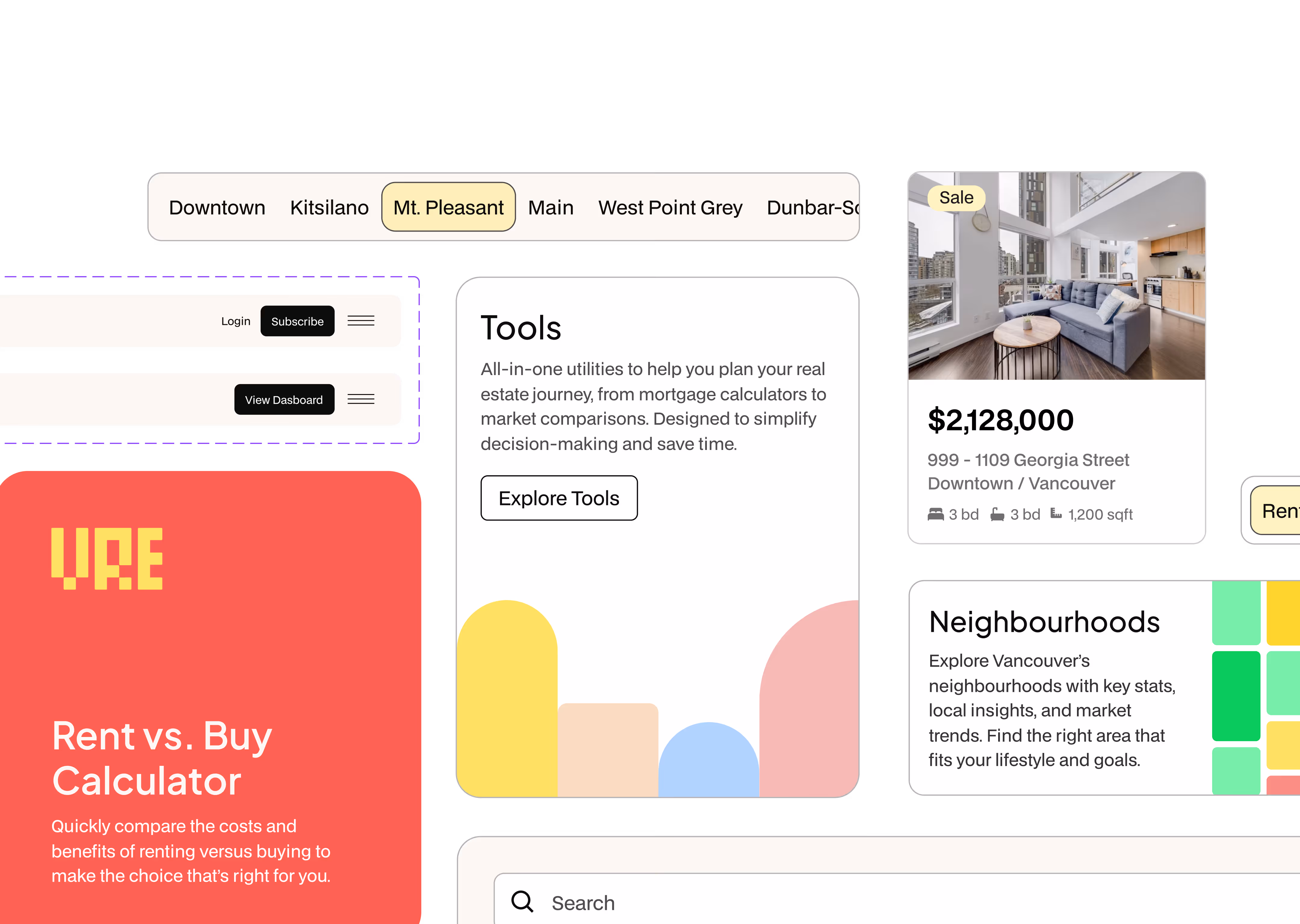
Choice-based Search bar
Our research showed that most real estate platforms overwhelm new users by immediately presenting a wall of generic listings. My solution was to design a choice-first search bar that shifts the focus from listings to user goals. This immediately directs people to what they need most, whether it's buying, selling, renting, or simply learning about the market. By framing the initial interaction around the user's intent, we created a clearer, more welcoming entry point to the platform and significantly reduced initial friction.

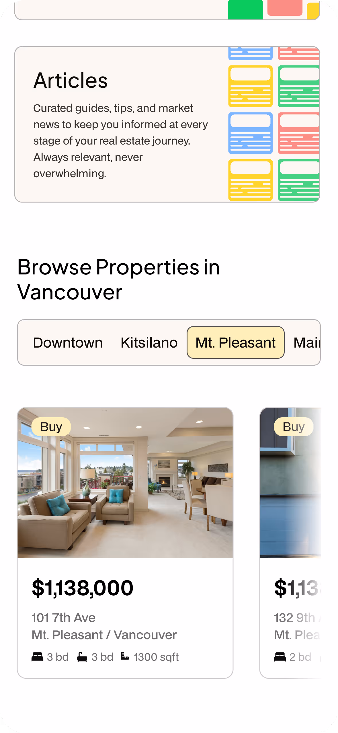
Interactive map search
Recognizing that price is the most critical and intimidating filter for first-time buyers, my solution was to transform raw data into a more intuitive, map-first experience. I designed a system that visually organizes the market into clear, color-coded 'value tiers' (e.g., affordable, premium, high-value). This transforms a complex landscape into an easily scannable exploration tool, empowering users to understand their options at a glance and make more confident decisions.

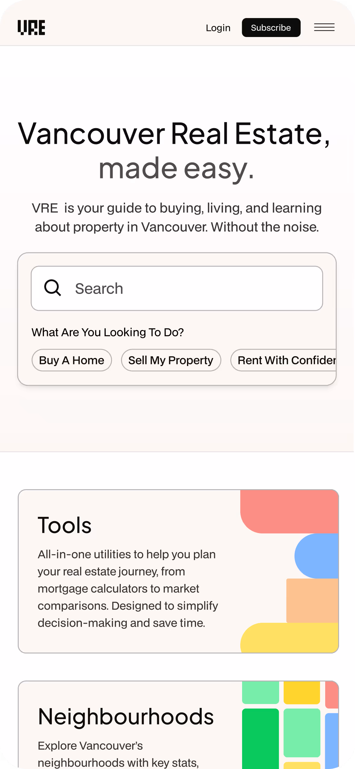
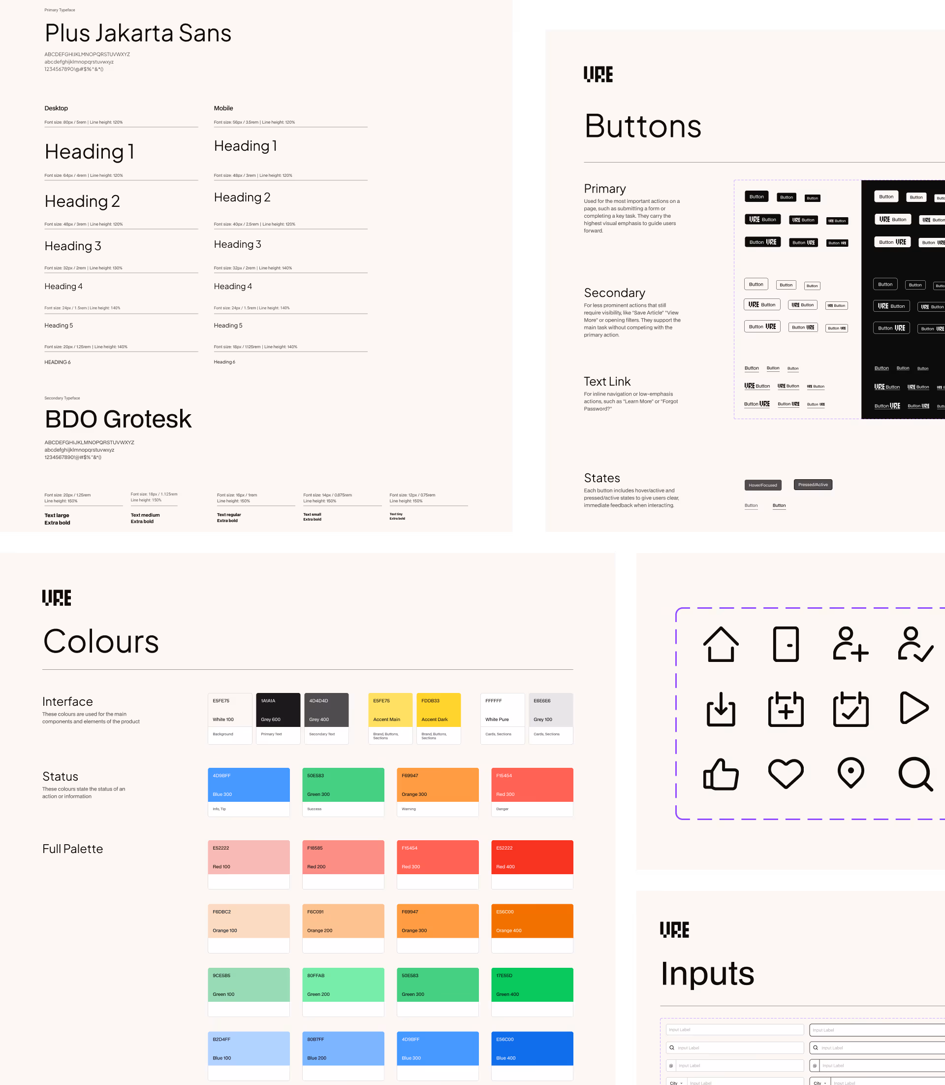
A System Built to Grow With the Product
To ensure the product could scale, I built a design system from the ground up. I created a library of reusable components and clear documentation guided by the principles of clarity and consistency. This system became our single source of truth, allowing the team to build a cohesive user experience with speed and confidence.
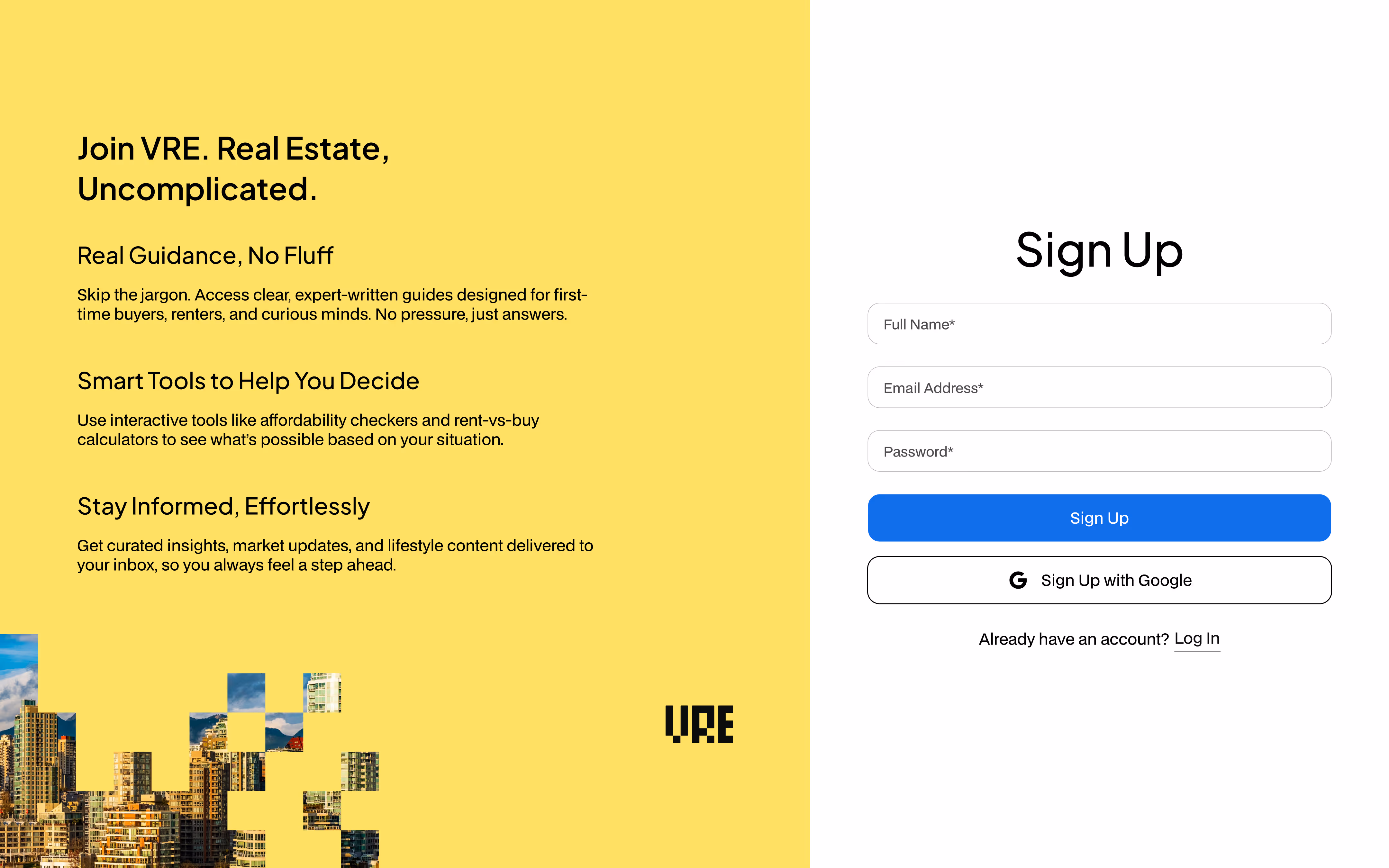
Giving the Product a Face (and a Bit of Soul)
I established the product's foundational brand identity, from logo design to defining its clear, modern, and grounded tone to guide our initial marketing efforts. By applying this identity to the product's design system, we created a polished and intentional user experience that felt cohesive and trustworthy.


Reflections and Learnings
A few months after the MVP was delivered, the managing partners decided to park the project, and although the product has yet to make it to market, the experience was invaluable. It pushed me to navigate complex business priorities, align cross-agency teams, and design a product vision that could scale, all under tight timelines and evolving requirements.
Simplicity wins in early phases
Stripping the product down to its core essentials made the MVP achievable and gave it a strong foundation for future growth.
Collaboration across teams is an art
Coordinating between multiple agencies, designers, and stakeholders taught me how to communicate design intent clearly while keeping everyone aligned.
Business goals and user needs must meet in the middle
Balancing investor expectations with user-first thinking was a constant challenge, but ultimately strengthened the final product direction.